SCREEN LAYOUT
The Menu Bar

Menu items
The Menu Bar runs across the top row of the screen and its main purpose (the selection of commands from the menus) is the same as with any other Windows application. In addition, the title bar area above the menu names is used to display certain prompt messages which indicate when the program has entered a particular editing or processing mode.
The Toolbars
As with other modern Windows applications, Proteus provides access to a number of its commands and modes through the use of toolbars. The toolbars can be dragged to any of the four edges of the application window.
Command Toolbars
The tools located along the top of the screen (by default) provide alternative access to the menu commands, as follows:

Command Icons
The command toolbar also carries the Output Job Manager, which generates a whole set of manufacturing outputs in one pass.
Mode Selector Toolbar
The toolbar located down the left hand edge of the screen select the editor mode, i.e. what happens when you click the mouse on the Editing Window.

Mode Icons
Orientation Toolbar
The orientation toolbar displays and controls the rotation and reflection for objects prior to placement on the layout.

Orientation icons
Toolbar Visibility
You can turn toolbars on and off from the Toolbar Configuration command on the View menu. However, it is perhaps more useful to collapse toolbar groups that are used infrequently.
To collapse a toolbar group right click on one of the icons and select the collapse command from the resulting context menu.

Collapsing the pad modes toolbar group
To select an icon in a collapsed group (switch modes) right click on the group and then select the mode you want from the resulting context menu.
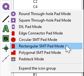
Selecting a pad mode from a collapsed toolbar group
To expand a collapsed toolbar group right click on the group and select the expand option at the bottom of the resulting context menu.
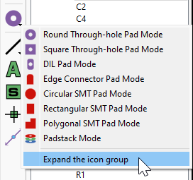
Expanding a collapsed toolbar group
Themes and Icon Sizes
Proteus ships two themes: a high-contrast light theme and a dark theme. Both are customisable, and you choose between them from the System Menu > System Settings command.
The same dialogue sets the icon size. The default is Auto, which sizes the icons from the monitor DPI, and the alternatives are a fixed 16 pixels, a 24 pixel minimum, a fixed 24 pixels, a 32 pixel minimum or a fixed 32 pixels.

Choosing the theme and icon size in System Settings
Theme and icon size changes are applied when you next start Proteus. If you change themes you might want to consider colours for layers on the editing window. You can control layer colours as well as layer visibility defaults from the Edit Layer Colours/Visibility command (Ctrl+L).
Changing to larger icon sizes together with collapsing toolbar groups allows large icons without too much clutter to your screen real estate.
The Editing Window
The Editing Window displays the part of the board that you are currently working on.
The contents of the Editing Window may be redrawn using the Redraw command which also redraws the Overview Window.
Panning
You can reposition the work area over different parts of the layout in several ways:
- By clicking left at a point on the Overview Window, which re-centres the work area about the marked point.
- By clicking the middle mouse button to 'pick up' the sheet, moving the mouse to re-position the sheet and then clicking the middle mouse button again to 'drop' the sheet.
- By moving the mouse over the Editing Window, holding down the SHIFT key, and 'bumping' the pointer against one of its edges. This pans the display in the appropriate direction.
- By using the Pan icon on the toolbar.
Zoom In / Zoom Out
You can magnify or reduce the display of the board using the Zoom In and Zoom Out commands which can also be invoked via keyboard shortcuts (by default, the F6 and F7 keys). Additionally, you can use the shortcut key for Zoom All (F8 by default) to display a view of the entire board. You can also use the corresponding icons on the toolbar or simply roll the middle mouse button in or out to zoom in and out respectively. In particular with the latter, you can roll the mouse button while panning by clicking the middle mouse button to pick up the sheet, rolling the mouse to zoom out and in whilst moving the mouse to re-position the sheet. While this sounds complicated it is in fact extremely intuitive in practice.
Variable Zoom
An arbitrary degree of magnification can be achieved using the Shift-Zoom feature. A given area of the board can be selected to fill the Editing Window by holding down the SHIFT key, pressing the left mouse button and dragging out a box around the desired area. The area can be marked on either the Editing Window or the Overview Window.
The Overview Window
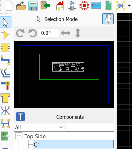
The Overview Window
This window shows a simplified representation of the whole drawing. One box marks the outline of the work area as set by the Set Board Properties command on the Technology menu, and a second box indicates the region on view in the Editing Window. Both boxes are drawn from the current theme palette, so their colours depend on the theme you are using.
Clicking left at a point in the Overview Window re-centres the Editing Window around this point. The overview has a fixed snap of 0.1 inch.
The Overview Window is also used to display previews of objects that are selected for placement. This features helps you to orient (rotate and mirror) an object correctly before placing it on the board.
The width and height of the Overview Window can be adjusted by dragging its borders. If you drag the vertical border right over to the other side of the application Window, Proteus will re-organise the display so that the Overview Window and Object Selector are located at the right hand side.
Pinning the Panes
The Overview Window and the Object Selector share a single pane, so pinning applies to both together. Unpin the pane to hide it dynamically and maximise the Editing Window space, which is particularly useful once the parts are on the layout. Use the pin button at the top of the pane, or right click on it and select the Pin the tool box or Unpin the tool box command from the resulting context menu.
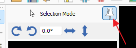
Pinning and unpinning the Object Selector and Overview Window pane
The Object Selector
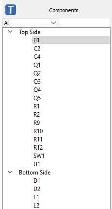
The Object Selector (Selection Mode)
The Object Selector is used for picking components, packages, pad & trace styles and so on from those that are currently available. It is also a really useful board navigation tool and provides contextual information based on the current mode. The width and position of the Object Selector can be adjusted in conjunction with the width and height of the Overview Window, as described above, and the pane can be pinned or unpinned as described under Pinning the Panes.
Selector Buttons
A row of buttons sits above the Object Selector. Which of them appear depends on the current mode, and each is described under the mode sections below. The buttons are icons rather than letters, and the names below are the command names you will find in Set Keyboard Mapping:
- Pick from Libraries, to bring a part, package or symbol into the layout from the libraries.
- Library Manager, to launch the library manager module.
- Create, to create a new style of the current type.
- Edit, to edit the style or object currently highlighted in the selector.
- Update, to update the highlighted package or symbol from the libraries.
- Delete, to delete the highlighted component, pad or trace style if it is not in use anywhere on the layout. This is the quickest way to prune the layout's own style list.
- Tag, to tag the object currently highlighted in the selector on the layout.
- Tidy, to remove selector entries that are not used anywhere on the layout. Available for the package, symbol, via, trace and pad selectors.
Selection Mode
In selection mode, the object selector displays a list of placed components grouped according to placement on the top or bottom side of the board.
Filters
The component list can be filtered in various ways via the combo box directly above the object selector.
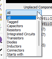
Filtering the placed component list in selection mode
Actions
- Use the Tag button to tag the component currently highlighted in the selector.
- Double click on a component to tag it and zoom the board.
- Hold CTRL button down + double click on different components to tag them cumulatively.
- Right click on a component for a contextual menu, notably allowing you to open the edit component dialogue form or remove the part from the layout.
Indicators
- Locked components have a padlock indicator at the right hand side.
Where components have been grouped, selecting one member of a group selects the whole group, and the group then moves as a unit. See Object Editing for grouping.
Component Mode / Placement Mode
Component mode provides a list of unplaced components which can be placed on the layout. Each component represents a footprint defined in the equivalent schematic part. Components will be grouped into project clips or placement groups where appropriate.
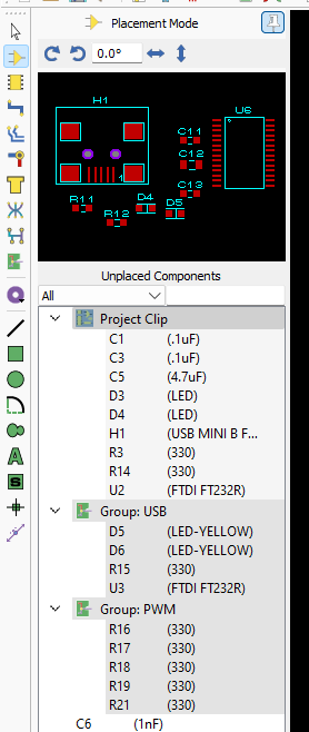
Unplaced components grouped into a project clip and a placement group
Filters
The component list can be filtered in various ways via the combo box directly above the object selector. The tagged filter is particularly helpful as it allows you to lay out your PCB in stages. You can block select a logical design section on the schematic (e.g. USB connector circuitry) and then use the tagged filter to product a working set of components for PCB layout.
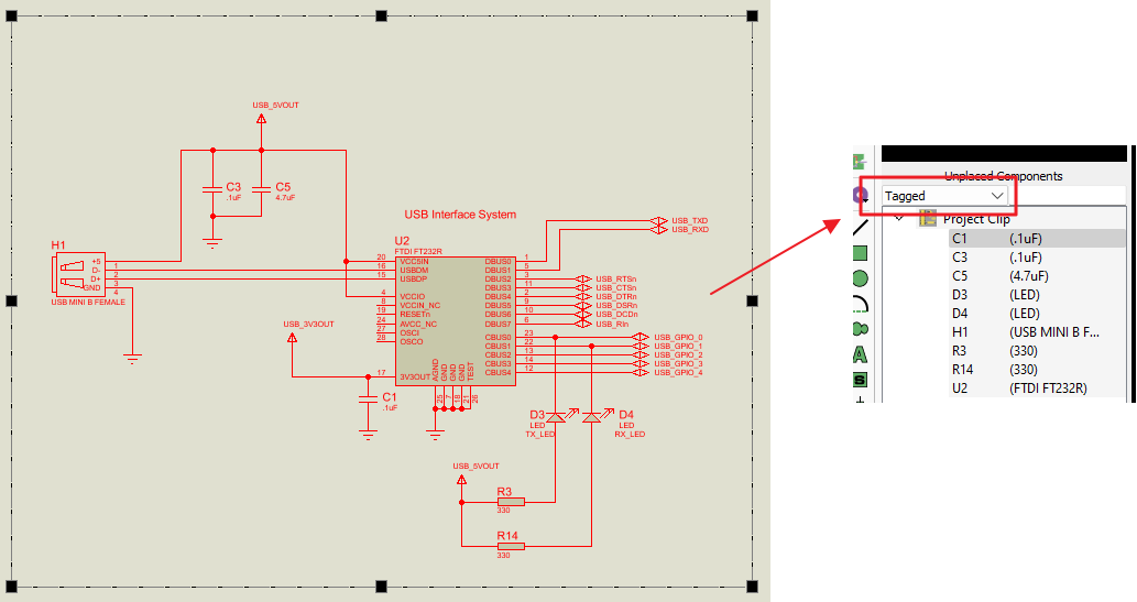
The tagged filter restricting the component list to a working set
Actions
- Hover the mouse over a component in the object selector for tooltip information.
- Left click in object selector to select a component. Then left click on editing window to begin placement and left click again to commit placement.
- Right click on a component in object selector for a contextual menu, notably allowing you to open the edit component dialogue form or remove the part from the layout.
Indicators
- Dimensions and preview of the selected component are shown in the overview window above.
- Part values are displayed alongside the part references. Tooltip on hover provides more information about the footprint type and dimensions.
- Components which have no footprint specified on the schematic will be shown with a cross at the right hand side. You can still place these parts but will be prompted to assign a footprint when you do.
- Components which are part of a project clip will be shown inside a tree node with the project clip name. Note that the entire project clip places as a single entity.
- Components which are part of a group will be shown inside a tree node with the group name.
Package Mode
Package mode displays a list of the footprints specified in the netlist. It's important to understand that these are not instances of parts on the schematic (see components above), but rather the footprints that have been specified for use. One package (e.g. 0603) will very commonly be used in 20 or 30 components for example.
Filters
Package mode has a reduced set of filters based on text search.
Actions
- Use the Pick from Libraries button to pick a new package into the layout. This is intended for modifying a package and is not directly related to the current project (schematic parts are associated with components, not packages !).
- Use the Library Manager button to launch the library manager module.
- Use the Tag button to tag the placed instances of the package currently highlighted in the selector.
- Hover the mouse over a package in the object selector for tooltip information.
- Left click in object selector to select a package. Then left click on editing window to begin placement and left click again to commit placement.
- Right click on a package in object selector for a contextual menu, notably allowing you to select all instances of the package currently placed on the layout.
Indicators
- Dimensions and preview of the selected package are shown in the overview window above.
Track Mode / Diff Pair Track Mode
These modes are used to place a route or a differential pair respectively. The object selector contains a list of available track styles for use, although which style is used for a given connection is defined in the net class tab of design rule manager.
See Also:
Actions
- Use the Create button to create a new trace style. This is a quick and simple process of providing a name and width for the style.
- Use the Edit button to edit a trace style. Be cautious about changing the width without changing the name because the names normally denote the widths.
- Use the Delete button to remove a trace style that is not used anywhere on the layout.
- Use the Route Command Centre icon to configure routing mode (push and shove, hug mode, cornering etc.).
- Right click on a track in object selector for a contextual menu, notably allowing you to select all instances of the trace style currently placed on the layout.
Unlike most other modes, left click on a style to select it for placement is normally not needed for tracks. The Auto Trace Style Selection icon means that the style is automatically selected based on your design rule manager configuration.

The Auto Trace Style Selection icon above the parts bin
You can select a trace style and then place routes using that style if you turn off Auto Trace Style Selection on the Tools menu (Ctrl+T). However, it is much safer to set up trace styles for net classes in design rule manager, leave Auto Trace Style Selection on and Proteus will always choose your specified style.
Indicators
- The Auto Trace Style Selection icon above the parts bin will be selected (on, which is recommended) or off (manual trace selection).
- The status bar will flash with a warning if you select a trace mode while Auto Trace Style Selection is on, since your selection will have no effect.
Via Mode
Via mode is used for the placement of loose vias and the object selector contains a list of available via styles. Vias are mostly created by double clicking during route placement rather than placed loosely via this mode. The via style chosen during route placement activation is set up in the design rule manager and the drill range configured in the layer stackup.
See Also:
Stitching and Shielding with Vias.
Via Tenting and Filling (NCVF)
Actions
- Use the Create button to create a new via style.
- Use the Edit button to edit an existing via style. Changes made without changing the via style name can then automatically be applied to placed vias on the layout.
- Use the Delete button to remove a via style that is not used anywhere on the layout.
- Use the Via Inspector button (via inside magnifying glass) to analyse the placed vias on the board or make a bulk change.
- Double click on an entry to launch the via style editor for that style.
- Right click on a via in object selector for a contextual menu, notably allowing you to select all instances of the via style currently placed on the layout.
Indicators
The tooltip on a via shows the number of placed vias of that style. Via Inspector dialogue is a more thorough analysis tool since it includes drill range information as well as tented/filled/NFP status.
Zone / Power Plane Mode
Zone mode is used for placing partial polygonal power planes (copper pour) on the layout. The object selector lists existing zones per layer and allows navigation.
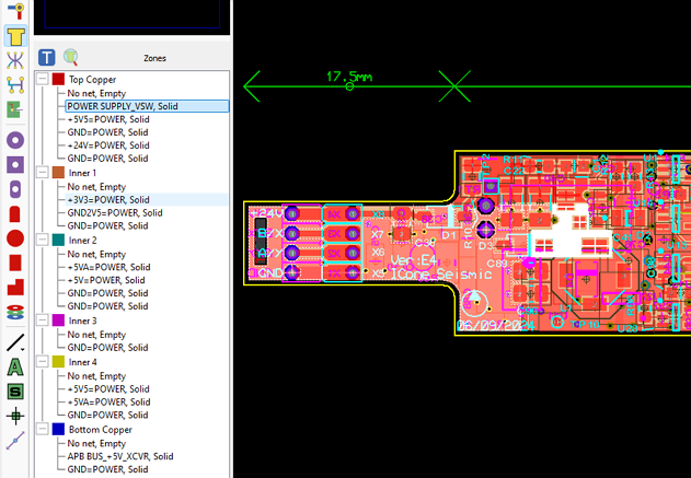
The Object Selector allows for easy view and navigation of power planes on the layout.
See Also:
Actions
- Use the Tag button to tag the placed zone currently selected in the object selector view.
- Use the Zone inside magnifying glass icon to launch the Zone Inspector dialogue form for full information about zone coverage and configuration.
- Double click on a placed zone to select it on the layout.
Indicators
- The net of the zone and its type (solid or hatched) are shown in the object selector.
- Zones are grouped per layer automatically.
- Plane layers are indicated beside the layer.
Ratsnest Mode and Connectivity Highlight Mode
Ratsnest mode provides a list of all of the nets in the netlist in the object selector. Connectivity highlight mode shows routing and connections currently completed on the layout. In either case nets are grouped by net class.
Filters
- The length matched filter will restrict the object selector view to nets with length matched routes, grouped by matchgroup. See also indicators section below.
- The differential pair filter will restrict the object selector view to diff pair nets. See also indicators section below.
- The testpoints filter will restrict the view to nets with testpoint coverage. See also indicators section below.
Actions
- Use the Tag button to tag the pads and any ratsnest lines (ratsnest mode) or tracks (connectivity highlight mode) on the net currently selected in the object selector.
- Use the length matched icon to select all length matched routes on the layout.

The length matched icon above the parts bin
- Double click on a net in the object selector list to tag pads and ratsnest lines for that net on the layout.
Indicators
- Nets are grouped by net class in the object selector.
- Nets with Length matched routes have a different background colour.
- When filter is set to length matched members of a matchgroup that are non compliant will highlight in red and display whether they are larger or smaller than the target length.
- When filter is set to differential pairs non compliant diff pairs will be highlighted in red and an indication given of their size relative to specified target length.
- When filter is set to testpoints each net will show the required number of testpoints for that net (if any specification has been made) or just the number of testpoints placed if not. Non compliant nets will be highlighted in red.
See Also:
Room Mode
Rooms on the layout are areas of the board either set up for placement or exclusion of a group of components (a placement room) or to define an area of the board with different design rules (a DRC Room). The current list of rooms on the layout is shown in the object selector.
Actions
- Use the Tag button to tag the room currently selected in the object selector.
- Double click on a room in the object selector list to tag and zoom to that room on the layout editing window.
Indicators
- Right click and select tag or double click to zoom and select a room on the board.
- DRC rooms are individually named. Placement rooms are either named by group or prefixed with Ignore/Keepout/Any as specified during their creation.
See Also:
Pad Modes
The various pad modes are used for the placement of loose pads such as mounting holes and for the rare occasion where a package needs hand crafting from pad and graphic primitives. The object selector displays a list of the currently available pad styles for the currently selected pad type.
Actions
- Use the Create button to create a new pad style.
- Use the Edit button to edit an existing pad style.
- Use the Delete button to remove a pad style that is not used anywhere on the layout.
- Double click on an entry to launch the edit pad style dialogue form for that style.
- Right click on a pad in object selector for a contextual menu, notably allowing you to select all instances of the pad style currently placed on the layout.
Graphics, Text and Dimension Modes
The graphics modes are used for the placement of graphics objects on the layout, notably the board edge for standard shaped boards. Text and symbol modes place loose text or graphic symbols, and Dimension Mode places a dimension object on the board.
All of these modes share the Symbols selector, which lists the graphic symbols available and carries the Pick from Libraries and Library Manager buttons. Use Pick from Libraries to bring a symbol in from the symbol libraries, then left click on the editing window to place it.
Marker Mode
This mode is used for the placement of different types of marker on the layout. The object selector lists the available marker types and allows them to be selected for placement.
Measure Mode
Measure Mode is used to measure distances and clearances on the layout without placing anything. The object selector has no role in this mode.
See Also:
The Layer Selector

The Layer Selector
The Layer Selector is used to display and select the current layer or layer set. A layer is a single layer, whereas a layer set is a combination of single layers, such as 'ALL'.
The layer selector can be operated with either the mouse or the keyboard. The default keyboard controls are as follows, with the command name that each maps to in brackets:
| Shortcut | Description |
| SPACE | Selects the next layer in the current layer pair sequence (Toggle Layer). |
| PGDN | Selects the next layer down the list (Next Layer Down). |
| PGUP | Selects the previous layer up the list (Next Layer Up). |
| CTRL+PGDN | Selects the last layer in the list (Bottom Layer). |
| CTRL+PGUP | Selects the first layer in the list (Top Layer). |
All the keyboard mappings above are configurable via the Set Keyboard Mapping command on the System Menu, where you will find them under the command names given in brackets.
Selectable Layers
Which layers are displayed in the list is determined by the current editor mode, such that PCB objects cannot be placed on inappropriate layers. It will also be limited by the Layer Stackup settings on the Technology Menu.
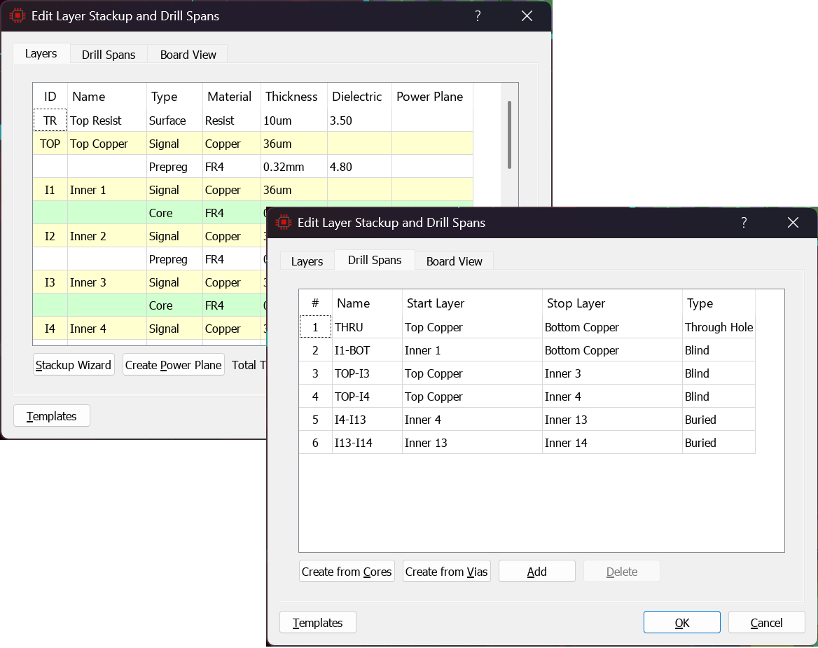
The layer stackup determines which layers the layer selector offers.
Displayed Layers
Which layers are displayed is controlled with the Edit Layer Colours/Visibility command on the View menu (Ctrl+L) or via the icon at the side of the layer selector.

The displayed layers icon beside the layer selector
Layout views allow you to configure various different layer visibility options into named groups, including paper colours and solder resist/paste mask visibility. You can then assign a view to a keyboard shortcut for easy access. Typical examples might be:
- ALL : All of the layers turned on.
- TOP: Top copper, top silk, top resist, top paste, ratsnest, board edge.
- BOT: Bottom copper, Bottom silk, Bottom resist, Bottom paste, ratsnest, board edge.
- INNERX: selection of inner layers in use with the current project.
Views are also useful for printing, with both a MONOCHROME and a white paper option.
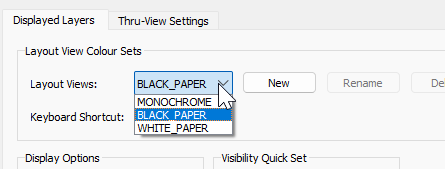
Layout views collect layer visibility settings into named groups with keyboard shortcuts.
Note that a view of drill hole only is potentially ambiguous because whether blind/buried vias contribute depends on the context (which layer ranges are we interested in). For simplicity therefore we include display of only thru-hole pads/vias when only drill holes is selected for viewing.
Layer Associations
Layer pair sequences can be redefined using the Layer Pairs command on the Technology menu.
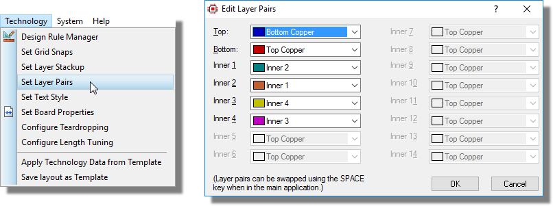
Technology > Layer Pairs and the Edit Layer Pairs Dialogue Form
This command defines the layer that the SPACE key will select for each layer (for example when dropping a via during route placement).
See Also:
Layer Pairs and Manual Routing (Tutorial)
Co-ordinate Display
The current co-ordinates of the mouse pointer are displayed down at the bottom right of the screen by default. The read out can be in imperial or metric units and a false origin may be set. The Toggle False Origin command (keyboard toggle O) and the Toggle Metric/Imperial command (keyboard toggle M) can be configured via the Set Keyboard Mapping command on the System Menu or activated directly from the View Menu.
The Toggle X-Cursor command will display a small or large cross at the exact location of the current co-ordinates (that is, the precise snap location for placement). Again, this can be toggled via the View Menu or by using the mapped key on the keyboard (default X).